
The goal of this project was to redesign the POS module within the Wealthon Client Panel — the central place where restaurant owners and managers configure everything that powers the actual POS application used in their venues.
This module controls staff access, menu structure, printer settings, reports, and operational rules. Our mission was to turn this complex and fragmented setup into a clear, intuitive, and scalable experience that allows restaurant teams to manage their operations effortlessly — while staying fully aligned with the broader Wealthon ecosystem of products (POS, PAY, LIMIT, FLEX, and more).
Before the redesign, the POS module inside the Wealthon Client Panel was extremely feature-rich, but hard to use. Over time, new options were added without a clear UX strategy, which resulted in a fragmented and inconsistent experience.
Managers and owners struggled with:
In short
The POS module was powerful…
But only if you already knew how to use it.
For new users, it was a barrier.
For existing users, it was a daily frustration.
To redesign the POS module properly, I had to understand how different types of users interact with the system - both inside the Wealthon panel and in the actual restaurant environment.
💼 Restaurant Owner
Wants a high-level view of performance and financial stability. Needs quick access to reports, invoices, and product settings across locations.
💻 Manager
Handles daily operations: configures printers, updates menu items, manages staff accounts and permissions, monitors sales. Needs efficient workflows and flexibility.
🤵🏻 Waiter / Cashier
Works directly in the POS application (not the panel), but depends heavily on the settings defined in the panel. If something is configured incorrectly, service slows down.
🤵🏻 Kitchen Staff (KDS users)
Reads orders from the Kitchen Display System. They work in a fast, noisy, high-pressure environment — clarity and visibility are critical.
Key insight:
This was not just about designing settings.It was about designing how restaurants actually run. Every decision in the panel affects real people, in real time, during real service.
This meant the UX needed to be:
I was the Lead Designer responsible for the end-to-end experience of the POS module inside the Wealthon Client Panel, as well as its connection to the actual POS application used in restaurants.
My responsibilities included:
This was not a typical “design screens” role. It required product thinking, system thinking, and real ownership.
A cluttered interface that made simple tasks feel complex
Before the redesign, the POS module inside the Wealthon Client Panel had grown into a massive configuration tool — but without a clear design structure.
Each new feature was added on top of the old ones, leading to a tangled, overloaded interface that required experience, patience, and sometimes guesswork to navigate.
1. Cluttered dashboard and lack of visual hierarchy
The main POS dashboard presented too much information at once — dense tables, multiple font sizes, and inconsistent spacing. Users struggled to identify key KPIs or navigate to product sections quickly.

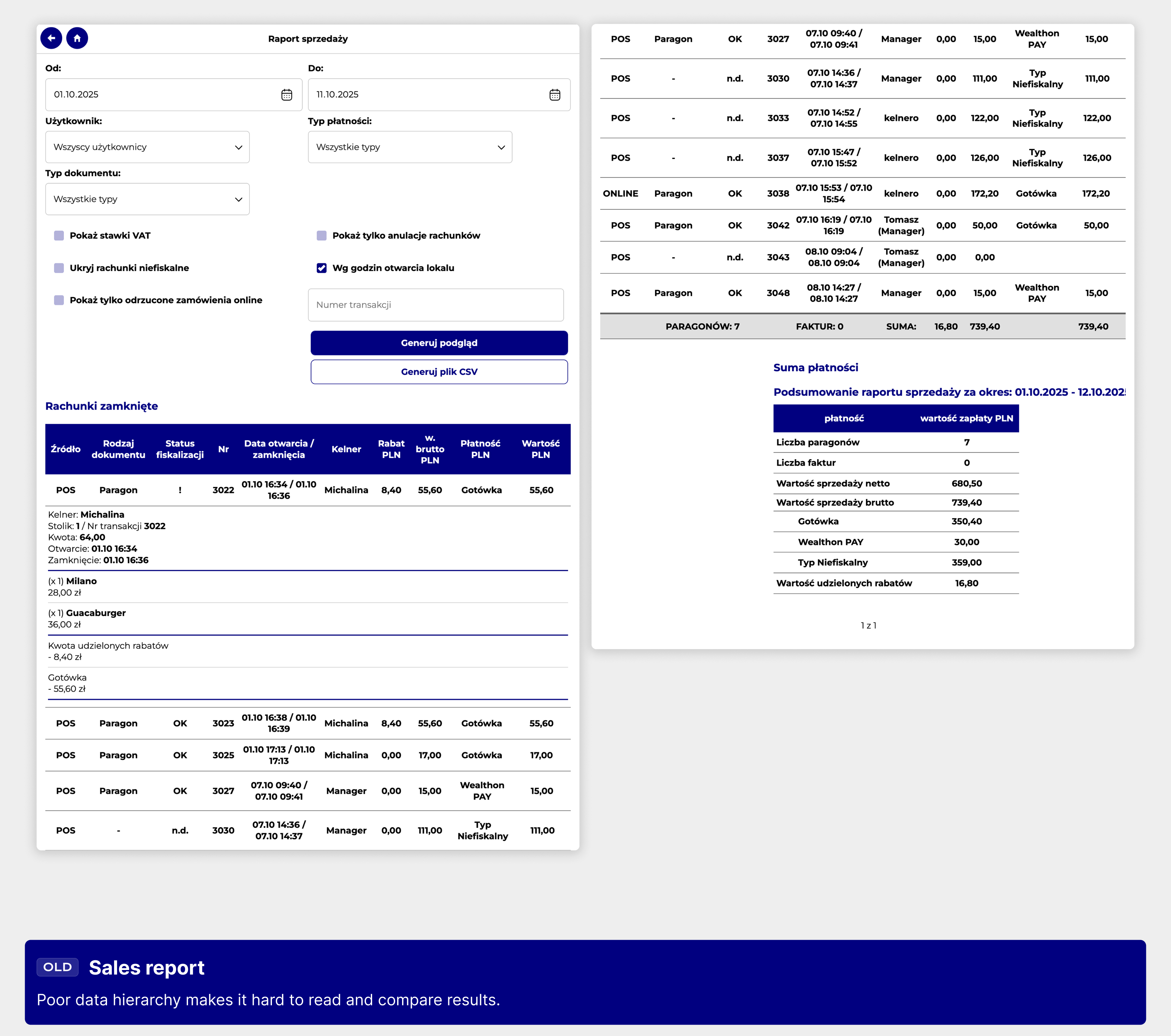
2. Nested and unreadable tables
Tables were deeply nested, expanding in unpredictable ways and making it hard to read or compare data.Users struggled to track orders, sold items, and revenue because the hierarchy and flow of information were unclear.
3. Fragmented navigation and lack of structure
Navigation between POS sections was unclear — users often had to go back to the dashboard to access related features.This broke the flow and made managing tasks like menu updates or viewing reports more time-consuming.

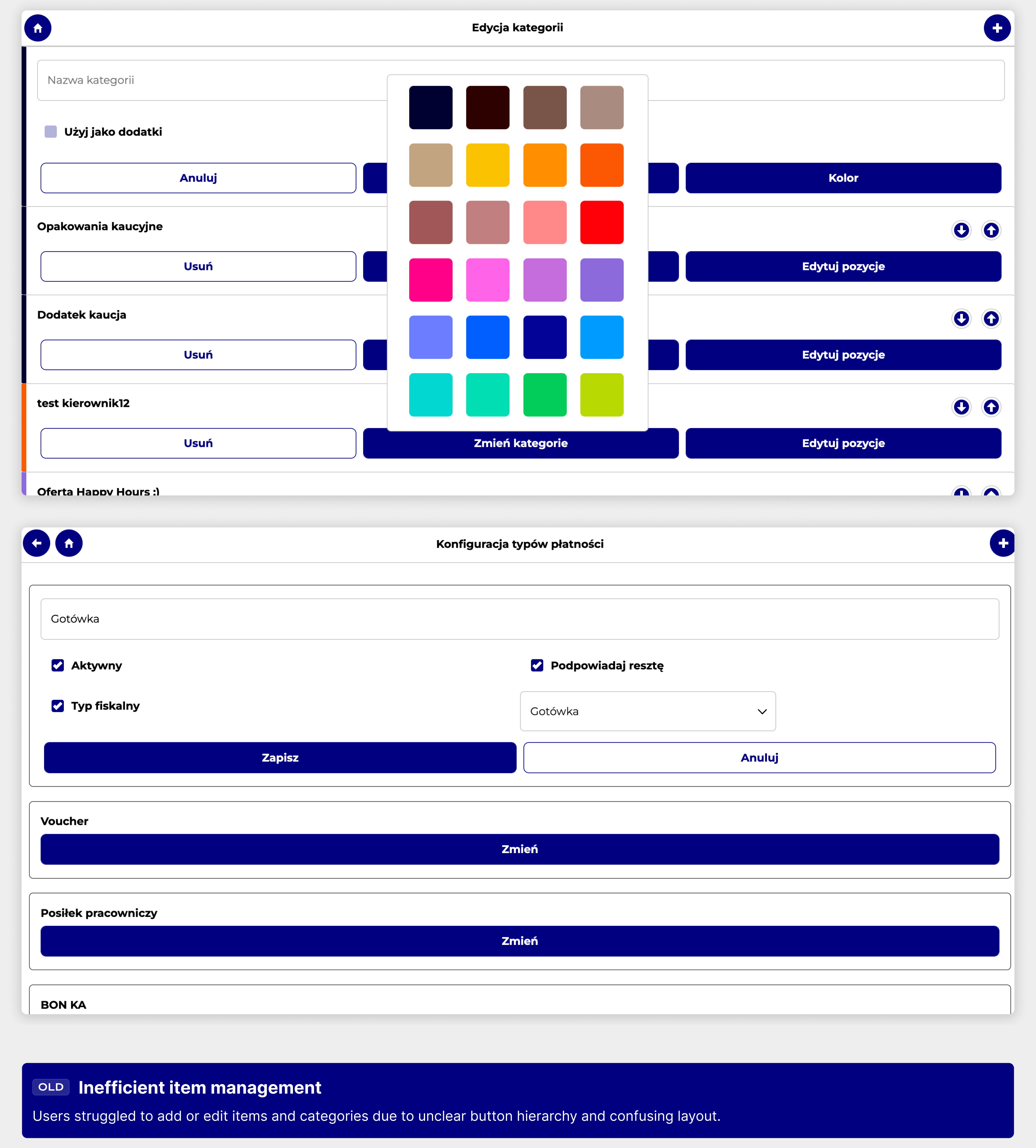
4. Inefficient item management and unclear hierarchy
Adding, editing, and managing items like menu entries or categories was cumbersome. Buttons lacked clear hierarchy and context, making it hard for users to know what actions were primary or secondary.Important actions were buried or visually similar to less important ones, slowing down workflow.
5. Outdated visual language and unresponsive layout
The interface didn’t reflect modern SaaS aesthetics and lacked scalability for different screen sizes.Tables and panels felt “boxed” and technical, rather than intuitive or user-focused.

We defined design goals not only based on business requirements for the POS module, but also considering the broader Wealthon Client Panel, of which the POS is an integral part.
Our focus was on clarity, consistency, and efficiency, ensuring that the POS fit seamlessly into the larger ecosystem while addressing key user pain points.
.jpg)
Due to time constraints, we skipped wireframes and jumped straight into high-fidelity UI exploration in Figma.
We used user stories from business analysts as a base for each flow, testing internally after each sprint.
This approach allowed us to iterate fast and align design with real system behavior.

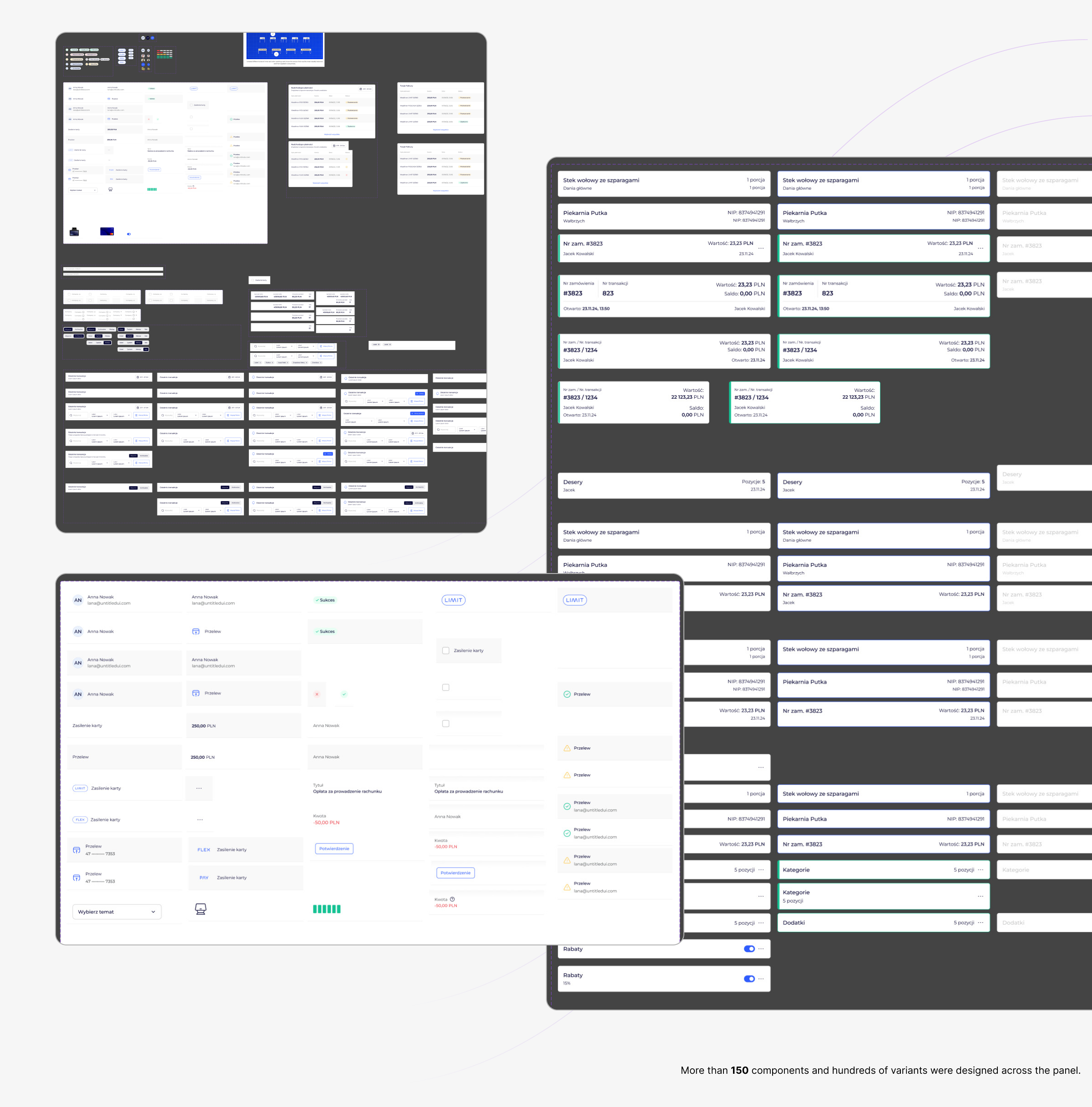
I built a dedicated component system for the Wealthon POS panel — a design layer that bridges consistency, scalability, and flexibility across the CRM ecosystem.
While the foundation was inspired by Untitled UI and an existing internal design system (which already covered core atoms like buttons, typography, and spacing), the POS redesign required a deeper level of customization.
I extended and refined the system with new, domain-specific components — purpose-built for the POS environment.
This included designing custom data tables, status indicators, widgets, bill components, and hierarchical menu structures that could adapt to complex real-world restaurant workflows.
The result was a modular and scalable library that unified the look and feel across Wealthon products, accelerated development, and ensured that future updates could be delivered faster — without compromising on usability or brand consistency.
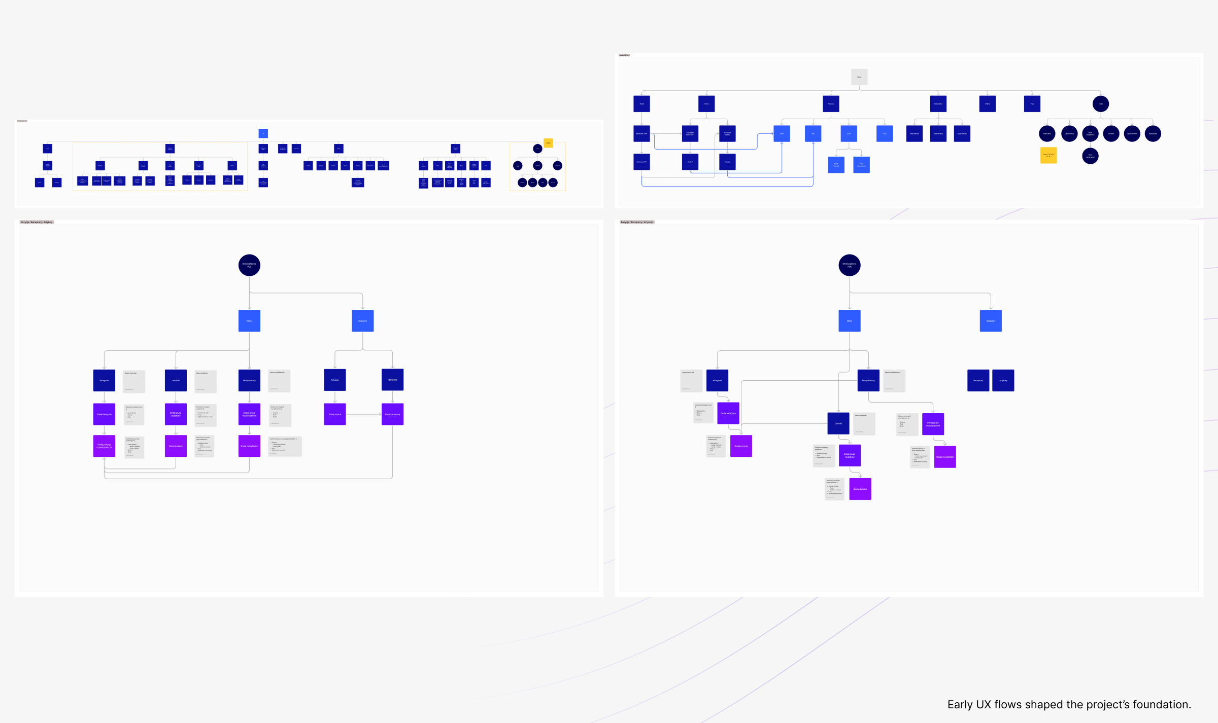
Each POS feature was redesigned as a clear, guided process — replacing the previous patchwork of forms and nested screens with structured, step-by-step flows that mirror how restaurant teams actually work.
The goal was not just to make the interface look better, but to make every action more predictable, discoverable, and context-aware.
We focused on building flows that reduce cognitive load, minimize errors, and create a sense of continuity between the Wealthon Client Panel and the POS application used in restaurants.
Each major flow was carefully mapped, tested internally, and refined with real user feedback from restaurant managers and support teams:
These redesigned flows became the backbone of the new POS experience — turning previously fragmented tasks into smooth, end-to-end journeys that support real-world restaurant operations.
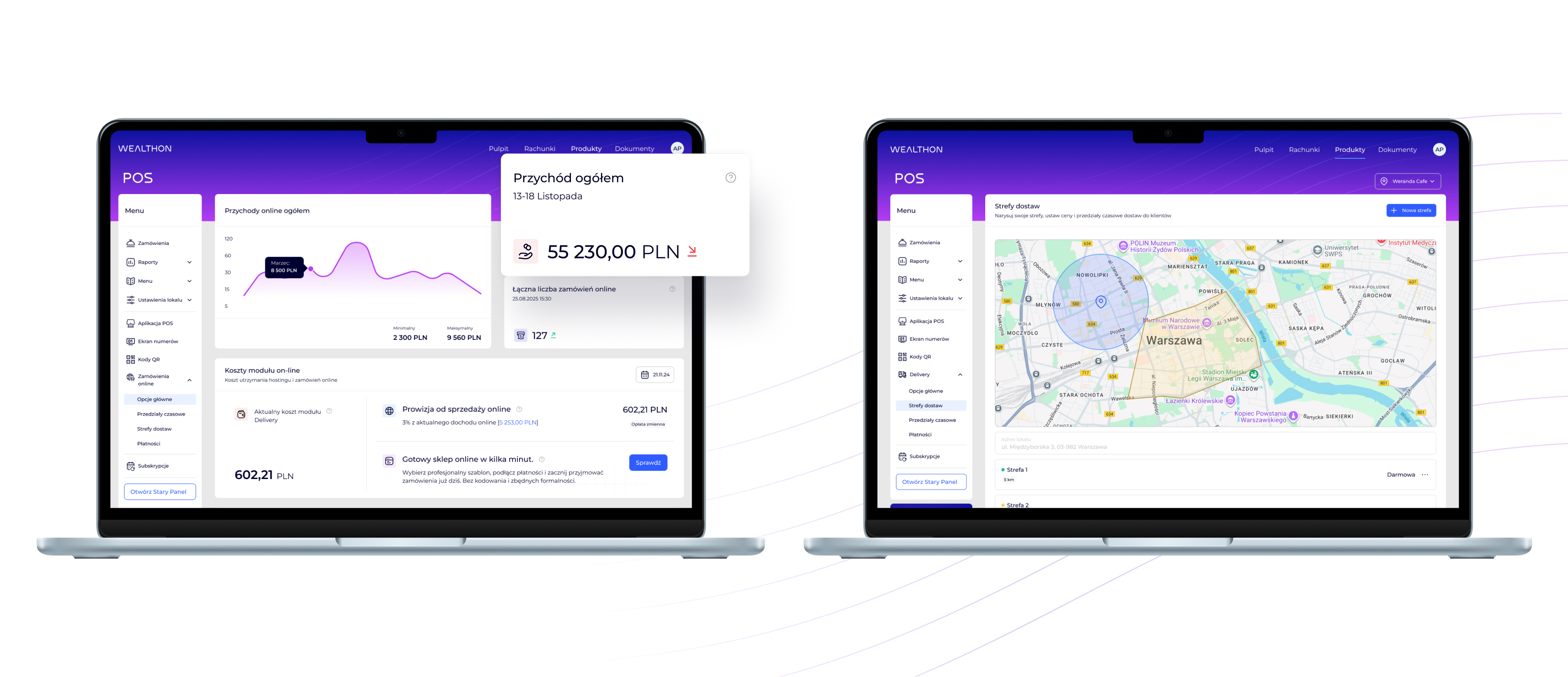
The redesign transformed the POS module from a cluttered, technical tool into a cohesive and easy-to-navigate management environment.
Overwhelming tables, inconsistent layouts, and heavy admin visuals were replaced with a structured interface built around clarity, balance, and hierarchy.
Typography and spacing were unified across all views, creating visual rhythm and readability even in data-heavy screens.
A calmer, more neutral color palette now draws attention to key metrics and actionable elements, reducing noise and helping users focus on what matters most.
The result is a POS management experience that feels modern, consistent, and intuitive — where reports, menu updates, and configuration tasks are faster, clearer, and more predictable.
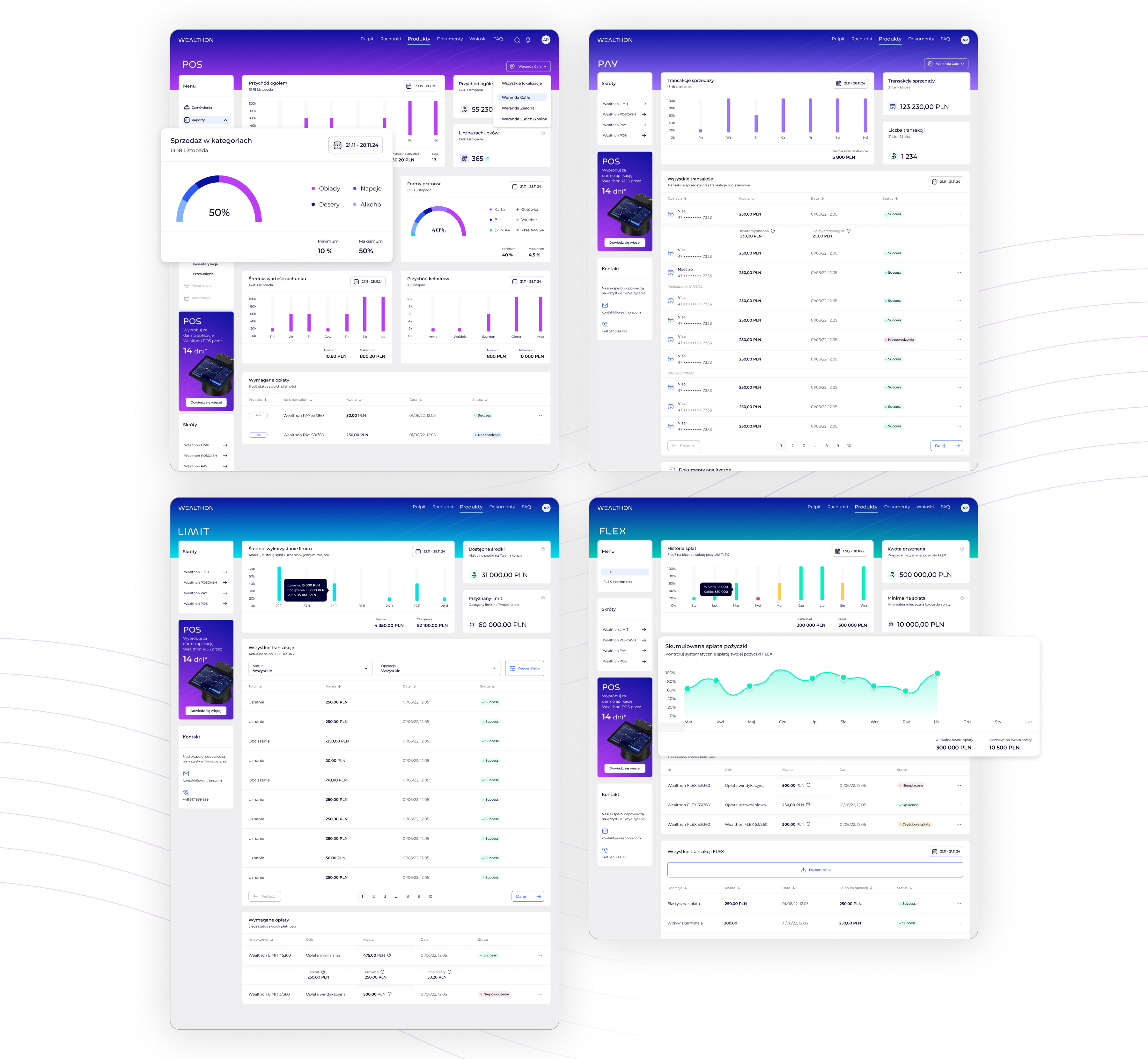
Managers and owners can now move between products (POS, PAY, LIMIT, FLEX) without friction, maintaining full control over their operations within one unified Wealthon ecosystem.
These redesigned flows became the backbone of the new POS experience — turning previously fragmented tasks into smooth, end-to-end journeys that support real-world restaurant operations.

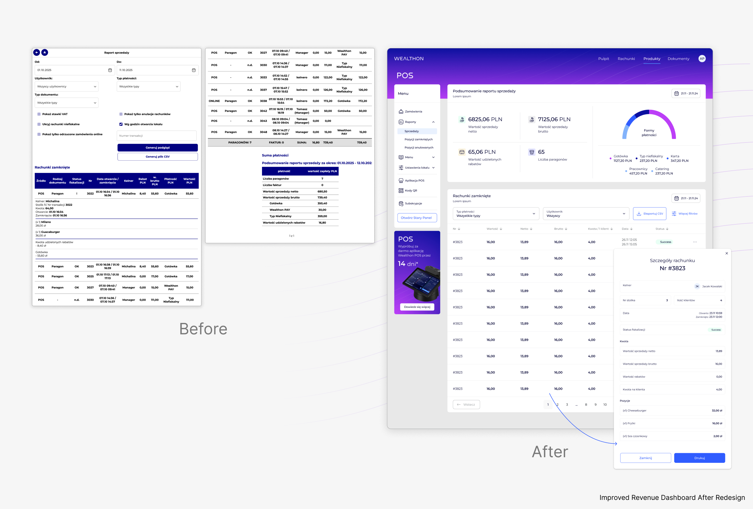
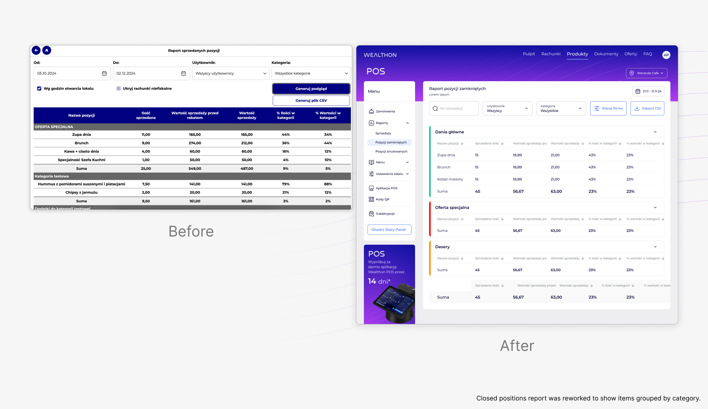

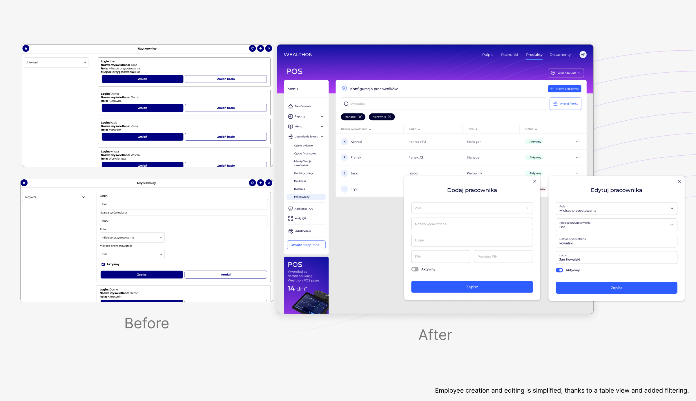
In one sprint, we attempted a quick visual update for the KDS (Kitchen Display System) without any user testing or interviews.
The goal was to modernize the interface and “polish” the visuals, but the result was immediate chaos:
This incident reinforced a critical lesson: a fast UI update is not always a good update.
A visually polished interface alone cannot replace a proper understanding of real user workflows. Effective design requires context, research, and validation with the people who actually use the system.
Since this incident, every UI change — whether minor or major — has been preceded by user feedback, testing, or at least scenario validation. Speed is important, but usability and real-world effectiveness are non-negotiable.

The redesigned POS module transforms a complex, fragmented interface into a clear, confident, and predictable workflow. Every screen was structured to reduce cognitive load, align with real user tasks, and seamlessly integrate with the broader Wealthon ecosystem.
Key improvements include:
The final UI doesn’t just look modern — it reduces errors, speeds up operations, and gives users confidence to manage their restaurants efficiently.



.jpg)