Hangin – Branding & UX/UI Design for a Social Meetup App

Connecting people through shared activities and local events.
Client: Hangin
Year: 2024
Role: Branding, UX/UI

Background

Observing the Need

We started noticing a common challenge: people often wanted to go out, explore the city, or try new activities, but didn’t always have anyone to go with. Whether someone was new in town, shy, or just looking to expand their social circle, casual social interactions could be intimidating. Existing platforms didn’t provide a simple, safe way to meet new people spontaneously.

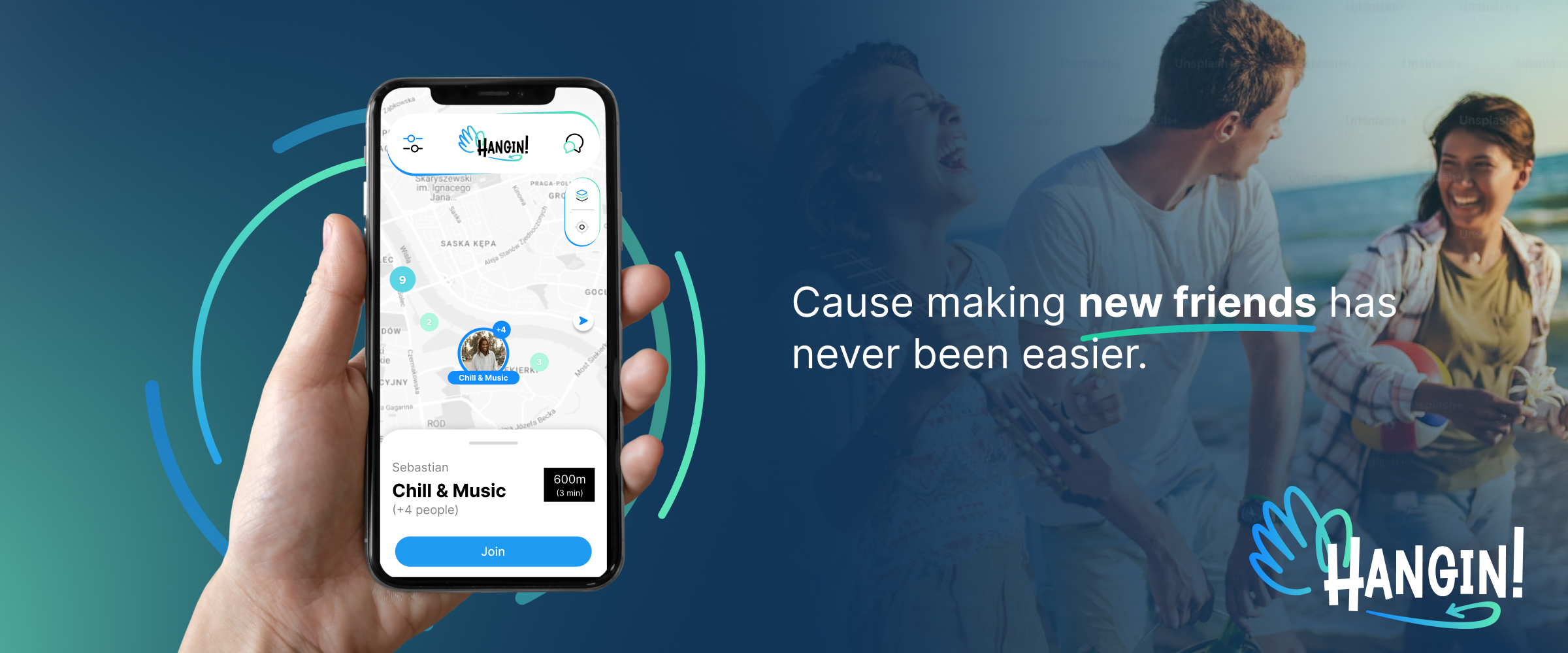
From this observation, the idea for Hangin was born—a mobile app designed to help users create or join local meetups, connect with like-minded people, and build social connections in a friendly and accessible way.

The Problem

Lack of Spontaneous Connections

While social apps exist, they often fail to address the needs of people seeking casual, local interactions without prior connections. Users lacked a platform to:

  • Discover nearby activities
  • Join groups with strangers safely
  • See events tailored to their interests

The challenge was to design an experience that made meeting new people intuitive, safe, and engaging.

THE MISSION

Creating a Welcoming Platform

Hangin aimed to bridge the social gap and help users connect spontaneously.
My role as Lead Visual & UX/UI Designer included:

  • Developing the branding and visual identity
  • Designing user flows, wireframes, and high-fidelity screens
  • Ensuring the app felt friendly, safe, and approachable

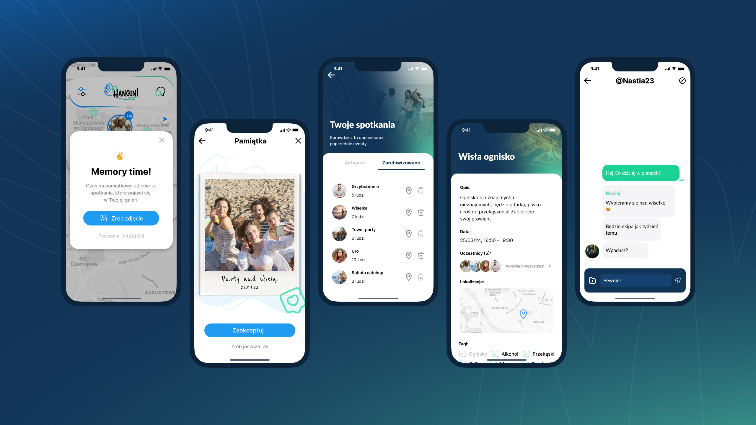
The goal was to enable users to browse meetups, join groups, create events, and explore profiles in a seamless, engaging way.

The Process

From Research to Design

Over several weeks, I collaborated with a front-end and back-end developer to create the platform. The design process included:

  1. Research & Inspiration: Analyzed social and meetup apps, identified user pain points, and mapped opportunities.
  1. UI & Branding: Developed logo, color palette, typography, and icons for a cohesive visual identity.
  1. Personas & Scenarios: Defined user personas for new residents, shy users, and event creators.
  1. UX Design & User Flows: Designed intuitive flows for creating/joining meetups, viewing profiles, and interacting safely.
  1. UX Design & User Flows: Designed intuitive flows for creating/joining meetups, viewing profiles, and interacting safely.

User Research

Learning from the Gap: No Good Local Solutions

There wasn’t much we could rely on locally, as no similar apps existed in Poland. Internationally, there were a few comparable platforms, but they suffered from poor UX/UI, weak branding, and unengaging experiences. None of them had a catchy, youthful, and modern look that could appeal to the target audience.

We drew inspiration from modern, visually striking apps that attract younger users and make interactions intuitive and fun—apps like Tinder, Bumble, and other social discovery platforms. The focus was on vibrant colors, clear hierarchies, and friendly interfaces that make social interaction feel approachable and exciting.

PERSONA

Who We’re Designing For?

We created personas to guide the design:

  1. New in town: wants to meet locals and make friends quickly
  2. Shy user: seeks safe, structured ways to join social activities
  3. Event creator: wants to organize meetups easily and track participation

These personas helped shape the user flows, information hierarchy, and interaction patterns throughout the app.

Bio

Janet spent 12 years as an elementary school reading interventionist. They set out to create their own curriculum after realizing nothing existed that catered to kids with different types of language and reading disorders.

Goal

  1. Meet new friends in her city
  2. Find local events or activities that match her interests
  3. Join social groups where she feels safe and welcome

Pain Points

  • Doesn’t know where to start when trying to make friends in a new city
  • Feels anxious about joining social gatherings alone
  • Existing social apps are confusing, impersonal, or don’t show reliable information about events/people

Design

Wireframing the solution

At this stage, I focused on creating low-fidelity wireframes—a clear blueprint of the app’s structure and user flow. The goal was to design an experience that feels intuitive and familiar, so users can navigate and interact with the app effortlessly, even on their first visit.

Key focus areas:

  • Simple, Intuitive Onboarding: Guided new users step-by-step, making it easy to set up a profile, explore meetups, and feel confident using the app. Subtle feedback and progress indicators encouraged users and made the process rewarding.
  • Clear Navigation: Streamlined access to creating or joining meetups with familiar icons and bottom navigation for quick browsing.
  • Event Discovery: Map and list views for local meetups, with filters for interests, distance, and group size to help users find relevant activities.
  • Profile Transparency: Displayed past meetups and reviews to build trust, while keeping layouts clean and easy to scan.
  • Engaging Visual Hierarchy: Prioritized primary actions (create/join meetup) over secondary ones, focusing on readability and smooth flow between screens.

These wireframes provided a solid foundation for high-fidelity UI design and allowed the team to iterate quickly while keeping user experience at the core

UI & Branding

Creating a Visual Identity that Speaks

When shaping the visual identity of Hangin, my goal was to make it feel lightweight, dynamic, and youth-oriented—an identity that resonates with young people and feels trendy and catchy at first glance.

When shaping the visual identity of Hangin, my goal was to make it feel lightweight, dynamic, and youth-oriented—an identity that resonates with young people and feels trendy and catchy at first glance.

  • Logo & Symbolism: The logo combines a sense of flow and movement, reflecting the app’s role in bringing people together and creating spontaneous meetups. The hand icon was chosen as a symbolic “hey, hi, let’s meet,” reinforcing approachability and friendliness.
  • Color Palette: I selected a blue primary color to establish trust and reliability, crucial for an app designed around meeting new people. To balance this, I introduced a vibrant accent color (#5CE5B7), adding a sense of energy, modernity, and dynamism to the overall branding.
  • Visual Communication: Beyond the logo, the branding system was designed to feel inviting and dynamic, with clear typography, spacious layouts, and engaging visuals. The communication had to feel accessible yet exciting, encouraging users to explore and connect.
  • Naming: The name Hangin emerged after several iterations (including early ideas like Hangout). It was chosen for its casual, modern tone, perfectly matching the target audience and the app’s spontaneous, social nature.

Iterations

Testing, Learning, and Refining

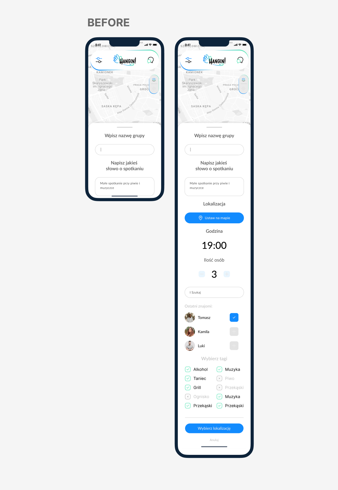
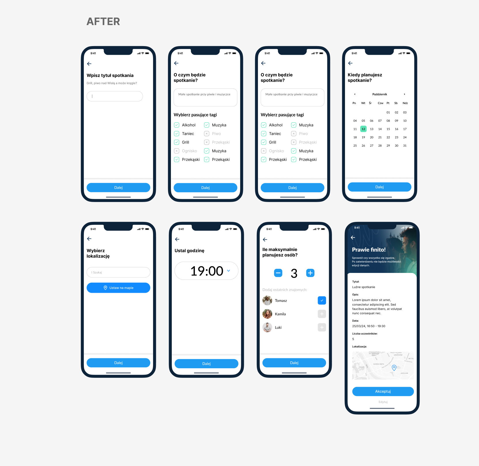
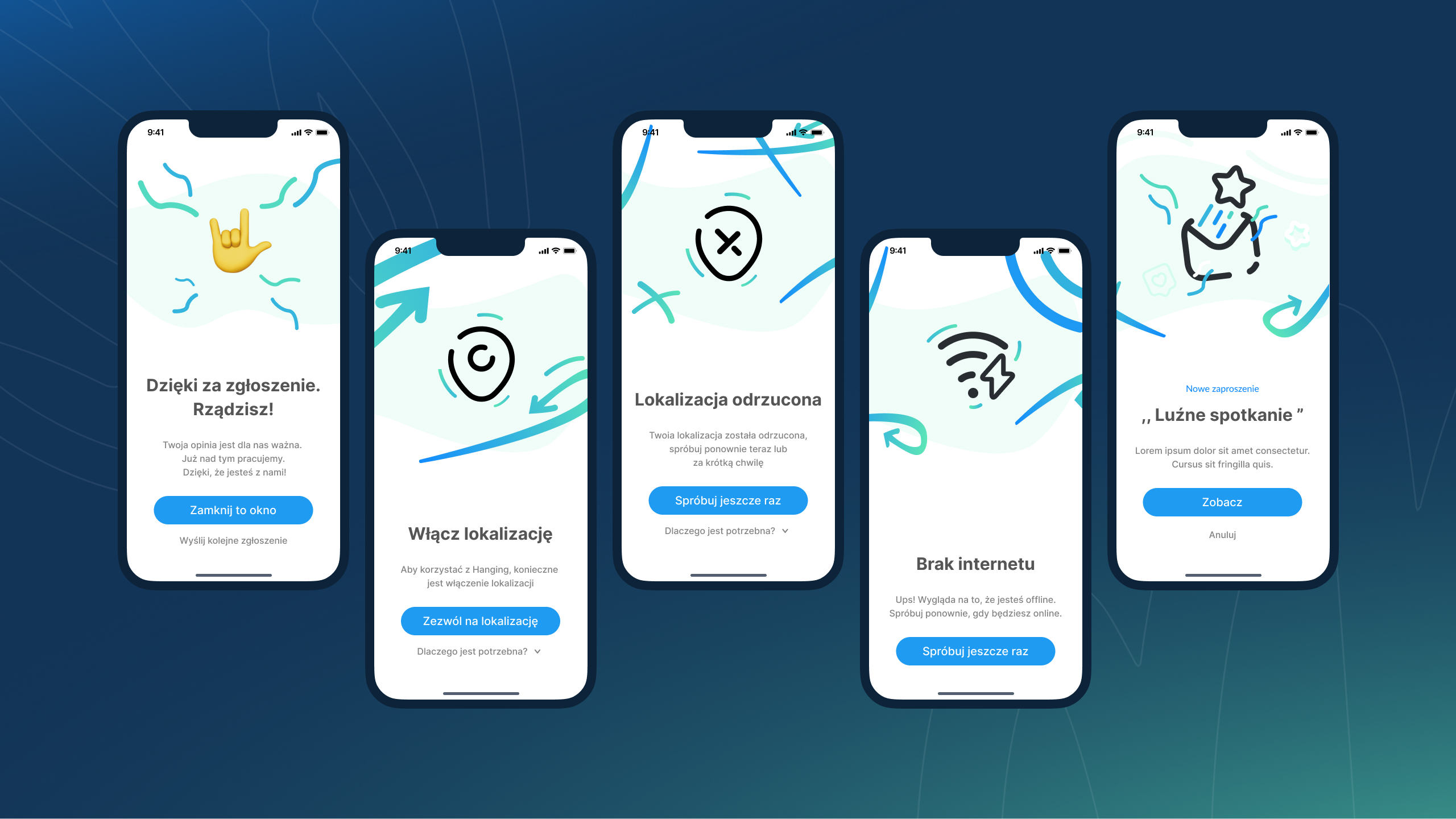
Design is never finished after the first draft. Throughout the Hangin project, I went through multiple iterations to refine the experience and make the product more engaging and intuitive.

Event Creation

LESSON LEARNED

This project taught me several important lessons:

  • Balancing design and implementation:
    ‍
    At first, I focused heavily on creating a beautiful, polished design. However, this quickly became a nightmare for the developer, as certain layouts left little room for essential content. This forced me to go back and redesign the interface to ensure both usability and technical feasibility.
  • Collaboration with developers is crucial:
    I realized how important it is to maintain constant communication with developers. Understanding technical limitations early in the process prevents wasted effort and helps ensure that the final product is realistic, scalable, and true to the design intent.
  • Content-first approach: I also learned to think more about content needs before visuals. Designing sections without considering the variety and flexibility of content can lead to constraints later. By starting from the content and flows, the UI becomes not only beautiful but also functional.
  • Iteration mindset: 
    ‍
    Finally, this project reinforced that iteration is key. Great design doesn’t happen in one pass — it requires listening to feedback, testing assumptions, and being ready to refine both UX and visuals to achieve the best balance between business goals, user needs, and technical reality.